I should have been thinking more clearly and loaded this. I thought I had already uploaded my rough draft, but apparently I didn't get that far. Overall, it ended up pretty much like how I envisioned it in the first place. Although, the fog isn't concentrated in the back, and I decided to forgo the symbolic portrait on the font. But my plan worked out pretty well from the beginning.
 The finished deal. I think I can be pretty safe in saying that I am quite pleased with the finished product. I really struggled with making the fog look graphic and fit in with the rippling water and the leaves on the trees. But I think all in all it turned out pretty good. Throughout the whole thing I tried to use a small color scheme to make the cover look as graphic as possible. So each component (trees, river, fog, text) I used no more than three colors to give it a simplified look. I really like the bold text as well. It, too, exemplifies the graphic simplicity of the book. It was fun to create a small logo for my fictitious publishing company as well. I also wanted to have that really simple. And it is. The name comes from the first thing that popped into my head, and that was my roommate. If I were to see this book in the bookstore, I think it would catch my eye and tempt me to flip through the pages.
 Bit by bit I am revealing my process for my book cover. I'm working backward from my last post, so bear with me. Hear is the picture I loaded into Photoshop. It was kind of a beast to cut out the background and all of the excess, but I'm pleased with how it turned out.
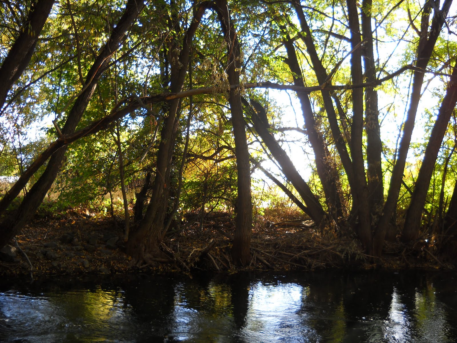
 Here we are at Project 2. I need to create a book cover from pictures brought into Photoshop. I immediately thought of Heart of Darkness by Joseph Conrad for this project because it has many symbols and motifs. I tried to bring out some of that in the cover with the Congo Jungle and river as well as the fog in the center image (although I'm not so sure how crazy I am about the fog...) There's also a couple fonts I'm thinking about. I really like the one I'm using now, but it's always good to have some options.
 My pictogram project is complete. I changed a few things from before, but I'm pleased with the overall effect. I decided to dismiss the early 1900's hat to avoid the "Mad Hatter" look. I think I like the 40's netted hat even better. I changed the hippie's hair also, so it wouldn't be confused with a nasty beard. Braids were a better choice. I really like the orange in the 80's clock's face. It contrasts much better than the purple did before. I was also pleased how the black and white images turned out. I think they read pretty well even without the color to communicate. Yay!
Here is my next step in my pictogram process. Off the sketch paper and into the computer. I chose a couple different picto grams than I was originally planning on, but I think these work better together. They are all from the same century. You've got your 20's, 60's and 80's....although I have seen some people with colored spiked hair within the last little bit....But as long as it gets the concept across that I want, that is good enough for me.
Finally! I have been having an awful time trying to get these images to load onto blogger. This is actually an introductory assignment we did to get more familiar with the art program. The image on top is a smattering of objects I found in own of my grandma's catalogs. I scanned in this collage and opened it in the computer program. So I traced and filled in with color and traced some more. I spent a some couple of hours with the program. I think I can say that I know the pen tool pretty well. The bottom image is the final deal. Wahoo!